MapCenter Texture Challenge – Making Rock Textures
This tutorials was originally posted on MapCenter’s forum as part of the rock texture challenge by way of giving a brief outline/explanation of how I worked with the PDS file originally received from a fellow texture artist.
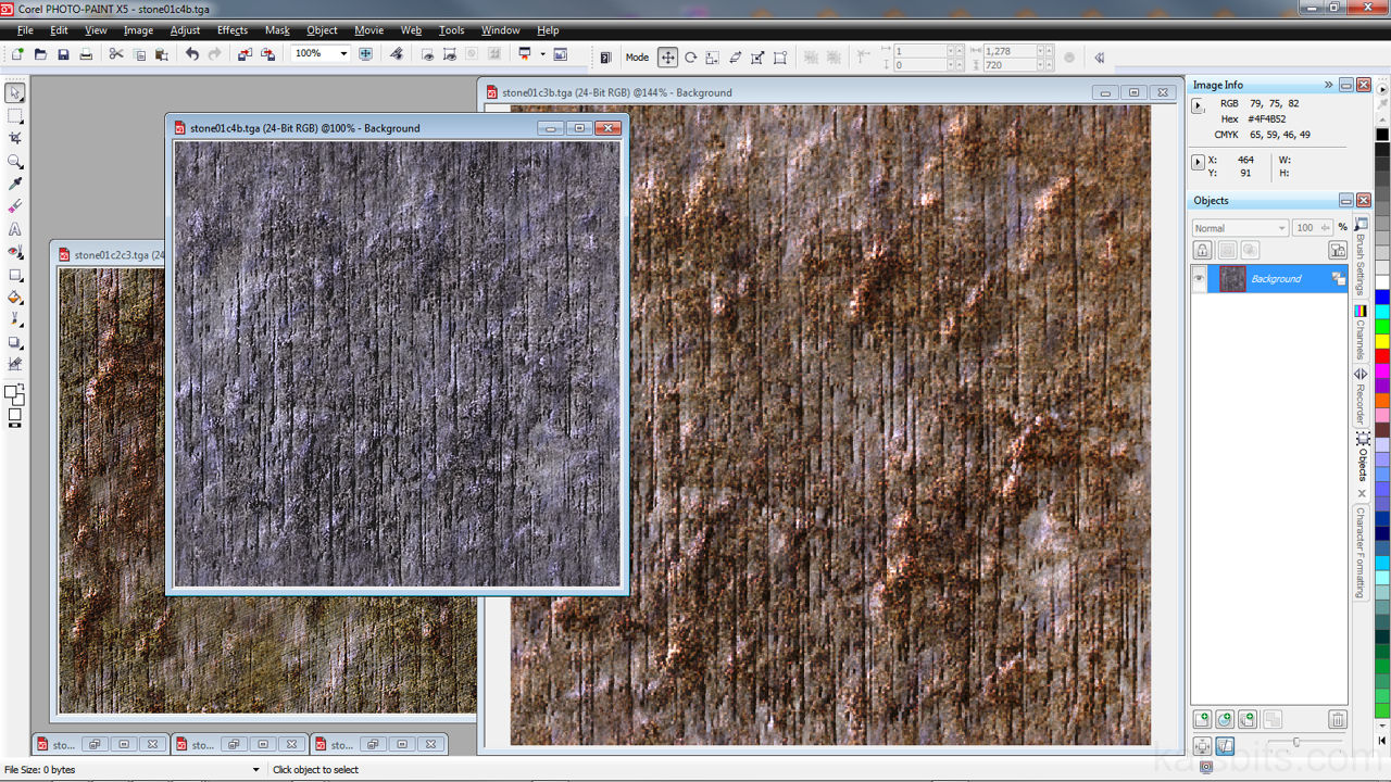
Download: Katsbits – Mapcenter Texture Set (c. 4 MB | *.tga).
The original file had a couple of layers, a sourced photo from the internet and some misc. ‘noise’ layers created as part of the original artists work before shared submission to the challenge. Both found use in the textures I put together but the quality of the photo grabbed from the net wasn’t too good (I must point out this wasn’t of the original artists making but a result of where the image was sourced), it had some interesting geometry though so I converted it to a black and white image so it could be used more effectively as a ‘bump’ or ‘height’ map, it worked very well used in this fashion.
Bear in mind that although the textures were originally created for use with static light mapped game environments, the following tutorial can be used in a broad sense when creating textures and art work for game engines that use dynamic lighting which require the use of a ‘diffuse’ layer as part of a texture set.
The General Approach to Textures
The two layers selected and highlighted blue in the image below are from eskimo roll’s original *.psd file combined with the other new elements on different layers to make an ‘original’ texture. Using layers like this is a good way to get different variations on a base textural theme as it makes extensive use of ‘merge modes‘ – they effect the way the layers are combined together by ‘adding’, ‘subtracting’, ‘multiplying’ or any number of about 20 different merging methods.
What this means in ‘real terms’ is that it’s not necessary to physically paint fiddly detail into the texture (nicks, cuts, scratches, that kind of thing), you’re relying on some very broad visual features on each layer because when they’re combined smaller details start to appear as a result. In fact that hardest part of using this approach is making sure the textures seamlessly tile correctly (‘offset’ the texture top and bottom by 50% and then check for seams which can be manually painted out).

The final texture
The Individual Layers
The original ‘noise’ layer that Eskimo Roll used was a photo sourced from some far distant corner of the internet and as can be seen below is pretty poor from a colour consistency point of view; there are all sorts of messy colour artifact and scrambling on the image, particularly around the lighter areas. Because of this the image was converted to grayscale, which evens out the artifacts because it limits the colour palette to 256 tones of gray, so it could be put to better effect as a ‘bump’ or ‘displacement’ map.

Showing the individual layers that compose the final texture
Design note: be careful of textures you find online. Because they have been made for a web site, the author will have had different concerns about the images, namely files size, so you can never guarantee the quality of what you find. There will more often than not be heavy jpg compression artifacts that make images found this way almost useless which then reflects back on the quality of the work you produce.
The Grayscale Converted Colour Original
The opacity (how transparent it is) of this layer is set to 100%, it’s solid and acts as a ‘foundation’ layer onto which everything else is blended. There is a black filled background colour, which is always a good idea to have in place, that can be used in the process as the results of using merge mode blending changes depending on what colour you’ve used (grayscale tones seem to be the best overall as they offer a more controlled environment to work in but you can add any colour that suits the needs of the textures).
You can also see now how converting the image to grayscale has ‘cleaned’ up the bad artifacts present in the original, we’ve now got a very good texture to use as a bump map.

Converting grayscale
Adding Variation
So that you’re not basically changing just the colour of the originals, it’s at this point you need to create some ‘uniquely featured’ layers.

Adding a ‘bump map’
In this particular case a layer was added and filled with a flat mid gray tone and then some light noise added. Corel PhotoPaint has a image effects filter called ‘Wet Paint’ which basically ‘drips’ the image downwards (which ever photo editing package you have this filter will be there but most likely under a different name, ‘wind’ or ‘rain’, something along those lines), this was then applied to the noise layer with a high setting (90%+ in this instance) so a good effect was achieved. The layer was then passed through the emboss filter with a low setting, just enough to highlight a small amount of depth for that 3D look (there are other ‘3D’ filters available, just choice one that’ll give you a decent look to the layer). It was then off set against itself to check for tiling issues, if any were found being grayscale meant it was easier to fix.
In the image above, if you look closely at the top of the layers panel on the right you can see the word ‘overlay’ and ‘100’; that’s one of the merge modes, along with a transparency value, which now means this grayscale image is going to be ‘merged’ with any layers below it based on those two parameters. The numerical values alters the transparency of the layer rather than the amount of the merge mode effect (which isn’t possible).
First Colour Layer
It’s about here that Eskimos sandstone texture comes into play. The good thing about this particular image is it’s pretty even in terms of visual features across the entire surface. This means we can concentrate on the colours blending to good effect rather than making sure any surface details don’t mismatch what’s already been done above. Using this layer adds a ‘gritty’ appearance to the texture overall which blends with the surface details provided above by our grayscale layers.

Colour/effect layer
Adding More Variation
Because the original variation layer above basically set the visual theme of the texture, a linear wear and tear pattern, it was felt that it should be expanded upon so further layers were made in using the same the same initial steps as previous – a mid gray fill, with noise and wet paint effect to the same values as previous – but the emboss levels were changed slightly to give a much softer 3D depth effect (you could also use the blur filter here). This basically gives the visual appearance of ‘aged’ wear and softer edges which combine well with the 1st layer to provide ‘new’ cuts and groves inside the softer edges and lines – note the merge mode and transparency settings. Again the layer was checked for tiling issues.

Adding another ‘bump map’
Colour Map
So far basically only one colour, or rather ‘tone’, has been used; the sandy coloured layer from Eskimos original psd file. Combined with the layers so far put together this tends to produce an image with very little tonal variation across it’s surface.

Adding a coloured ‘bump map’
To ‘fix’ this we can introduce a solid colour to a layer. An olive green was chosen in this case as it complimented the orangey-brown of the sandstone original, but any colour would have done just as well. On this layer you’ll notice another bump effect, in this case a previously created image was used to alter the layer so that it had a more random 3D pattern to it (the slight black and white checker pattern you can see is the work top visible due to the transparency of the layer).
Design note: The image used to alter this layer had been created using the cloud effect filer with an appropriate amount of emboss to give it visual interest. This is quite a good way to reuse you assets as it save time on you having to constantly create new layers and objects every time you make a texture.
Final Result
Once everything has been sorted out on an individual basis you can then set up the layers using different merge modes to get similar results to below; they’ve all combined to make a texture with some interesting surface features (the grayscale ‘bump maps’), a nice level of finer details (the ‘sandstone’) and some subtle colour variations (the green bumped layers).
What you can now do is use the merge modes and transparency values for each layer and subtly change the final look of the texture without doing too much hard work, it’s a very good way to create different textures using the same base theme.
So there you have it, our final texture, using layers, colours, ‘bump maps’, merge modes and transparency values.
Final texture

