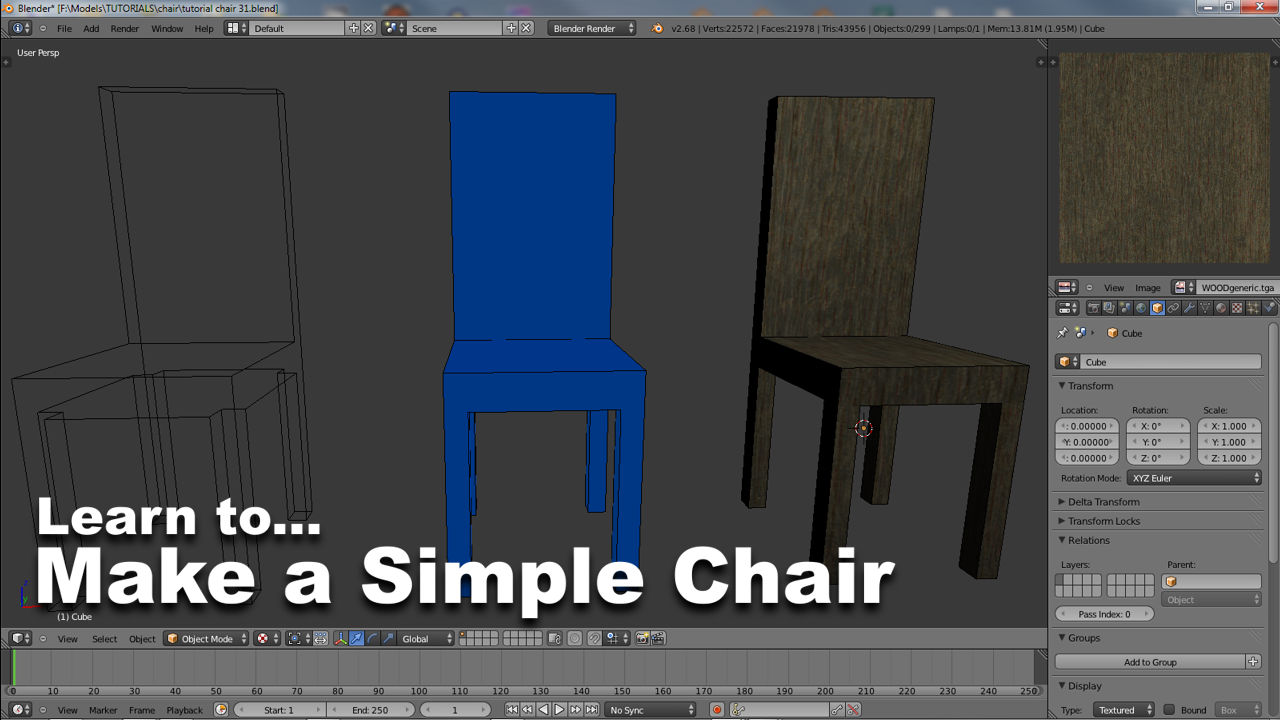
Make a Simple Chair & Learn Blender 3D (#1)
This multi-part tutorial on learning Blender 3D will explain the process of making a simple ‘kitchen’ style wooden chair by taking the reader through a number of logical steps from start to finish with the purpose of building an initial knowledge-base of the basic in’s and out’s of using the applications tools and features, whilst additionally aiming to develop a broader understanding of the principles involved in 3D content modelling.
You don’t necessarily need to have used Blender before to get the most from the tutorial but it will help if you have. Please also note that the following is not meant to be an exhaustive explanation on Blender 3D’s extensive features (for which there are many).
Download: KatsBits – Chair Source (c. 7 MB | *.blend, *.tga).
Note to legacy users: the new version of Blender 3D introduces a new User Interface and with it a fundamental reorganisation of most tools and functions Users may have been used to, where they are located and how they are accessed – this is true of any version from Blender 2.50 and above relative to 2.49, and again for Blender 2.70 and beyond relative to 2.50 » 2.69. The tools themselves remain largely unchanged – except for improvements in functionality – so for long standing Blender users, switching to the latest version should largely be a matter of simply re-training ‘muscle-memory’ to the new system.
Blender 3D’s default appearance
On starting Blender 3D a start screen appears displaying a number of useful options; a "Recent" list which provides the user with a way to quick launch previously opened projects; a "Links" list which has a number of other miscellaneous functions, including a selection of ‘help’ based initiatives. Users can choose an option from this opening panel or close it by clicking anywhere on-screen. Note: the screen changes depending on the version being used.

Blender start screen options (image used changes with each update)
")
Blender 2.71’s appearance on start-up, note ‘splash screen’ and other minor differences
Closing the start screen then reveals Blenders default scene composed of a large centralised main view surrounded by a number of other panels and elements. The main area in the centre of the screen is the ‘3D View‘ which, by default, contains a ‘cube primitive‘, a single ‘light‘ and a scene ‘camera‘ object, all of which are displayed to the user in ‘User Persp‘ (‘User Perspective‘) mode. These are Blenders scene defaults, loaded every time a new project is started.

Blenders default layout when open – applicable to Blender 2.50 thru 2.69

Default appearance of Blender 2.71 which has some minor differences (on the left side in particular) compared to previous version shown above
Blenders layout breakdown
Blender layout is divided into a number of areas by default, each of which serves a particular function or purpose depending on what the user is doing at the time. There are ‘Header‘ areas, highlighted red below; ‘Toolbar‘ elements highlighted blue; the main ‘Work Zone‘ highlighted green and finally the ‘Timeline‘ highlighted in yellow.

Blenders default layout broken down into sections
Header areas
The "Header" area elements generally contain menu functions (such as "File", "View", "Object" and so on) that are contexts-sensitive, that is the options and functions made available for use change depending on the activity being carried out at any given time (the one slight exception to this is the main application header at the top of the screen, this generally stays ‘as is’ throughout). For example tools associated with editing and selecting polygons only appear when editing a mesh, similarly, UVW tools only appear when unwrapping a model (more on both to follow). Each type of ‘view’ has a ‘header’ that can be positioned at the top or bottom of that individual view unit by right clicking (RMB) the header and selecting "Flip to Top"/"Flip to Bottom".

Blenders "Header" bars and areas
1) The main header element displays information about an entire scene and the objects visible within it. Most useful are ‘Vertex’ ("Ve:[n]"), ‘Edge’ ("Ed:[n]"), ‘Face’ ("Fa:[n]") and ‘Object‘ ("Ob:[n]") count details which relates information about either objects as they stand in a scene or elements of the same objects when in Edit mode.
2) Changes ‘View’ (or ‘Editor’) type. All views and editor types have this button allowing for the layout to be fully customised and changed to suit the activity being undertaken. Click here to read a list of shortcut keys for each view type.
4–7) Change depending on the view type – a different set of buttons and options appear when in Edit mode as does for using the Node editor etc.
The Work Zone (and view header)
Although Blender can be organised to suit the user, the default ‘Work Zone‘ is generally where all the actual work inside the application is done in terms of modeling, meshing and editing. Being a ‘view‘ it has a ‘header‘ element that changes depending on the activity being carried out; for instance, the 3D view which is shown by default, has a series of options and actions applicable to activities done whilst editing a mesh or when doing general object manipulation.

Blenders main work zone area
2) ‘View‘ (‘Editor‘) type. Changes a particular ‘View’ between available options such as "Dopesheet", "Outliner", etc. Currently displays a small cube denoting "3D View".
4) ‘Mode‘ type displays a drop down list of different core activities such as "Edit Mode", "Sculpt Mode", "Weight Paint", etc.
5) ‘View Shading‘ determines how objects are displayed in the 3D View, whether they are shown "Textured", as "Solid" shaded, in "Wireframe" only, etc.
6) ‘Pivot Point‘ options change the point around which objects are rotated and scaled. Using the different settings, objects can be manipulated relative to their physical "Individual Origins" (centre points), "3D Cursor" placement, etc.
7) ‘Layers‘ are used to organise a scene so that separate elements placed in different layers can be made visible or hidden at the click of a ‘Layer Buttons‘ (each button toggles the respective layer hidden/visible).
Toolbars and panels
It’s important to point out here that although the main toolbar on the right hand side of Blender appears to be a tool ‘bar’, it is in fact a set of positioned ‘view’ types windows (in the same way as the the main 3D ‘view’). By default the Toolbar contains a ‘Properties‘ view (the lower section) and an ‘Outliner‘ view (upper section) each with their own respective buttons, panels, tools and information.
The ‘Properties‘ view is generally where most tool options are located when working. The section itself is headed by a series of user interface (UI) button activated panels that contain specific tools per activity, function or action needing to be done or being used; editing a mesh would use the "Object Data" panel buttons for example, texturing would use "Material" and/or "Texture" panel buttons and tools and so on, the user clicking on each to switch between panels.
The tool bar on the left hand side of the 3D view is a context sensitive ‘Tool Shelf‘ that provides quick access to common tools and functions; it generally only appears when modeling and mesh editing in the 3D view and can be toggle hidden/visible ("T").

Blenders "Properties" tool bar and panels – in Blender 2.70+ the Toolbar (Tool Shelf) is organised into ‘Tabs’, related tools are grouped together an place on separate tabbed pages, accessed by click a ‘Tab’, i.e. "Tools" carries most of the general manipulation functions, "Create" carries the basic shapes and Object types that can be added to a Scene, and so on. Prior to this tools and options are simply listed on a scrollable panel
3) ‘Properties‘ view provides access to the core tool set of Blender used to carry out different types of activities, editing or creative functions; the "Render" panel contains options and controls for render still images and movies; the "Object" controls provide editing options for objects in a scene; the "Modifiers" provides options to apply filters and functions to objects, scenes and so on.
8) Choosing any given ‘Property’ option displays the relevant tools for a range of functions associated that activity. For example, "Object Data" displays "Vertex Groups" and "UV Texture" information which is related to the with manipulation of objects in Edit mode.
The Timeline
The Timeline is an additional view "Type" specifically related to animating, used as a means to playback and display data related to the scene being animated . The Timeline uses the same fundamental components as other view types so it too has a ‘Header’ where the various context-sensitive options appear, accompanying the main ‘work zone’, the area where the manipulation of data relative to animating is done. As this project doesn’t use the Timeline there’s no need to explain it beyond the basics mentioned above.

Blender and default "Timeline" section.1) View type. 2) context-sensitive menu options. 3) Playback buttons. 4) animation length (frame numbers). 5) Timeline
Next we’ll take a look at navigation, controlling movement around Blender, how various mouse and keyboard combinations allow movement, the manipulation of objects and rotation around the view ports.

